Norrsken
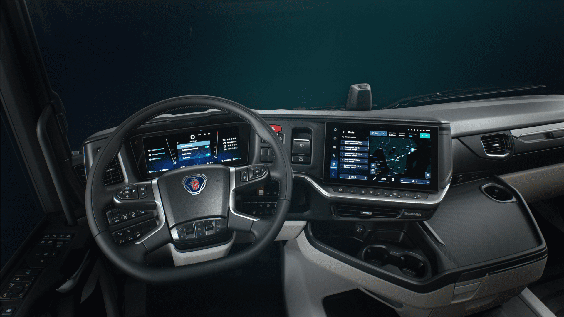
The new Scania ‘Smart-Dash’ Interface, encapsulated by the DDW UI concept, melds tradition with modernity by incorporating a classic green HMI colour, now tuned to a cooler Scandinavian hue reminiscent of the northern aurora lights (Norrsken). This design, influenced by a blend of Scania’s heritage and forward-looking electric vision, aims to provide a precise, intelligent, and elegant workspace for drivers. Core elements include the distinct 79° DDW Angle aligning with Scania’s design language, Aurora Borealis inspired lighting, a three-dimensional space denoting hierarchical information, abstract ice-like blur effects, dynamic information display for enhanced glanceability and interaction, and realistic 3D graphics to foster a tangible connection between the digital interface and the physical world.
CID Scaling
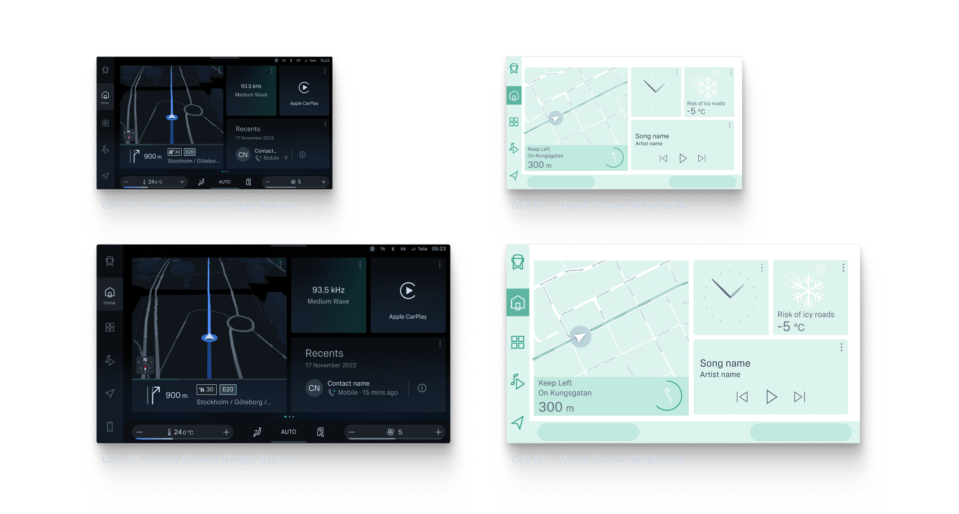
🧠 The Scania Smart Dash™ system encompasses both 10” & 12” touch displays, necessitating a design approach that first caters to the compact 10” screen before adapting to the 12” display. Utilising wireframes and interaction flows has been crucial throughout each visual iteration of these screens. Collaborating with the IXD_UX team, the design process prioritises interaction points before transitioning to visual graphic design (VGD), thereby facilitating a user-centric experience that’s both logical and intuitive.
Widget
System
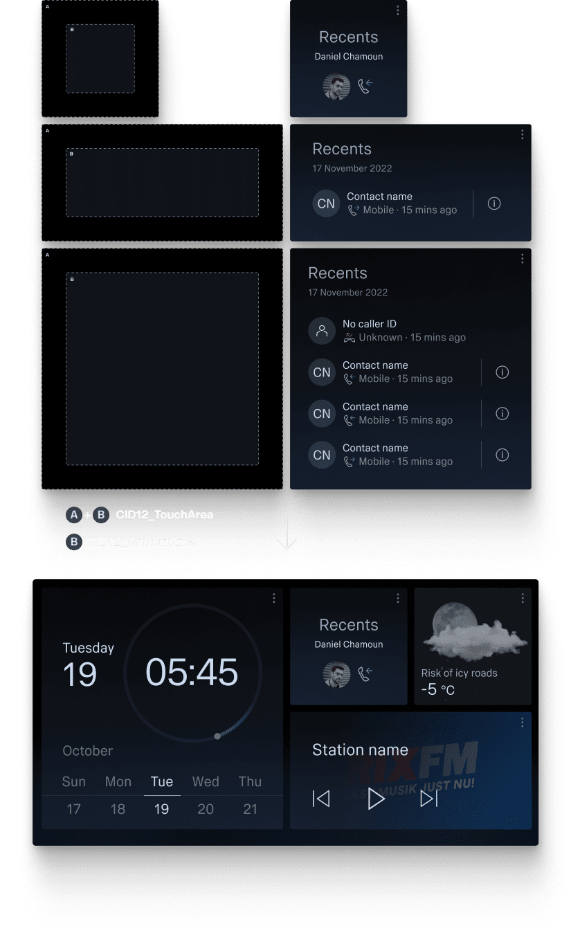
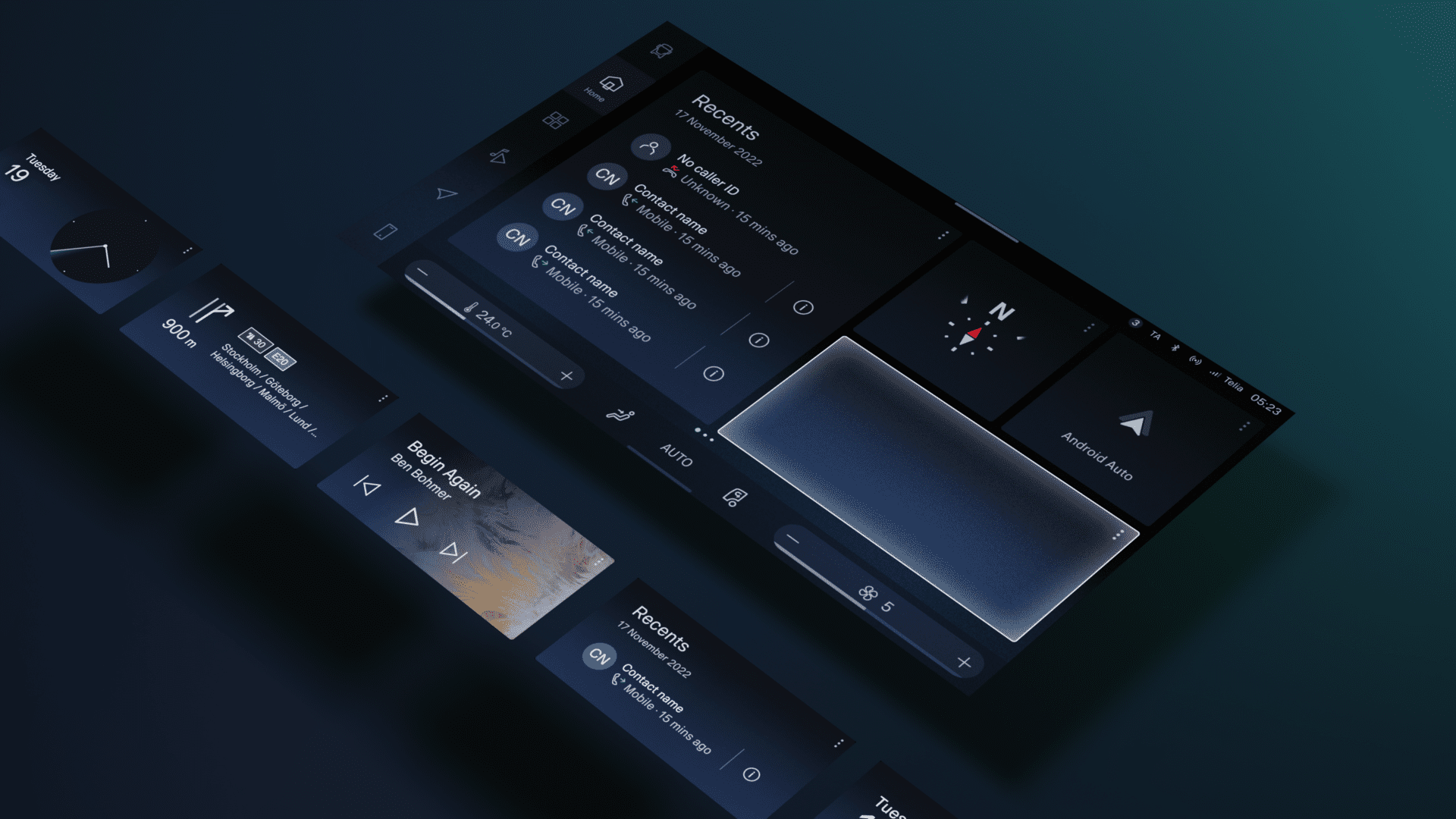
The Smart Dashes™ widget system is central to effortless navigation and success of the entire interface.
The home screen showcases a grid of fully customisable widgets, configured by the user, facilitating quick access to their preferred and frequently used features within the system. This personalisation aids in reducing glance times, leveraging user familiarity.
Minimal
Mode
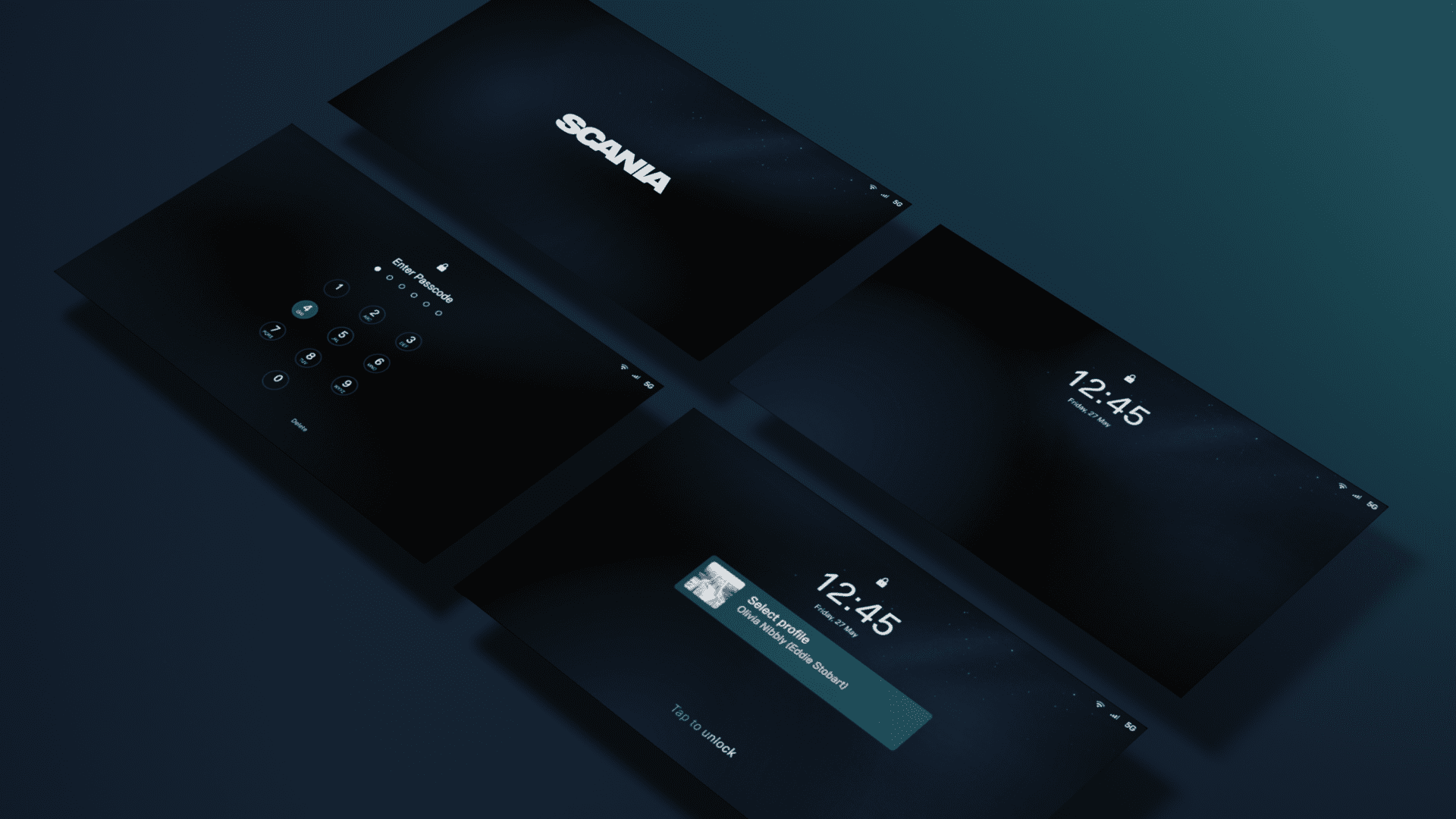
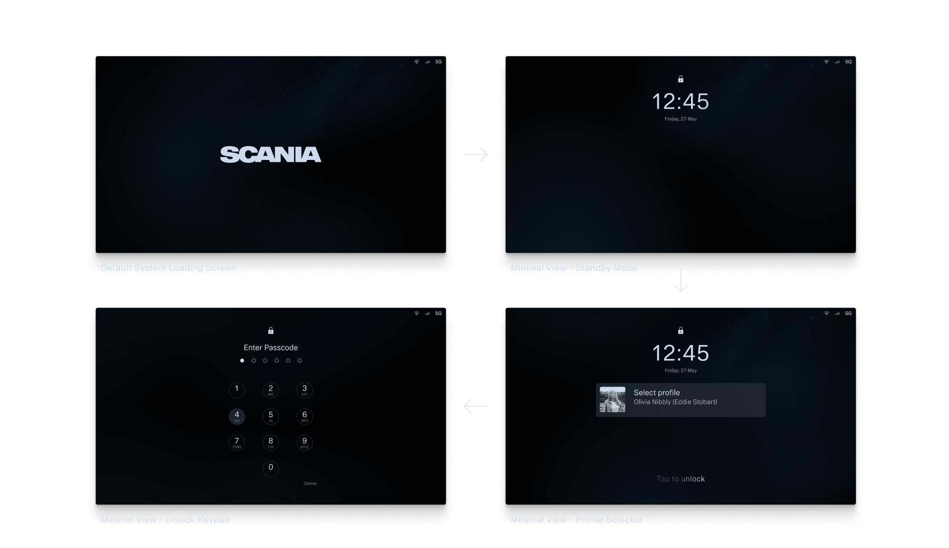
The Minimal View concept emerged from the understanding of hauliers’ nomadic work lifestyle and sharing of trucks during shift rotations.
It introduced unlockable user profiles, encapsulating individual’s personal settings for a tailored experience. Alongside, it brought a slice of home
to the cab with customisable lock screen backgrounds, enabling users
to upload cherished photos or companies to display brand-aligned assets, fostering a sense of belonging and brand adherence amidst the transient nature of hauliers’ work.
Foundations -> Iconography

Resources
Iconography
& pictograms
Guidelines
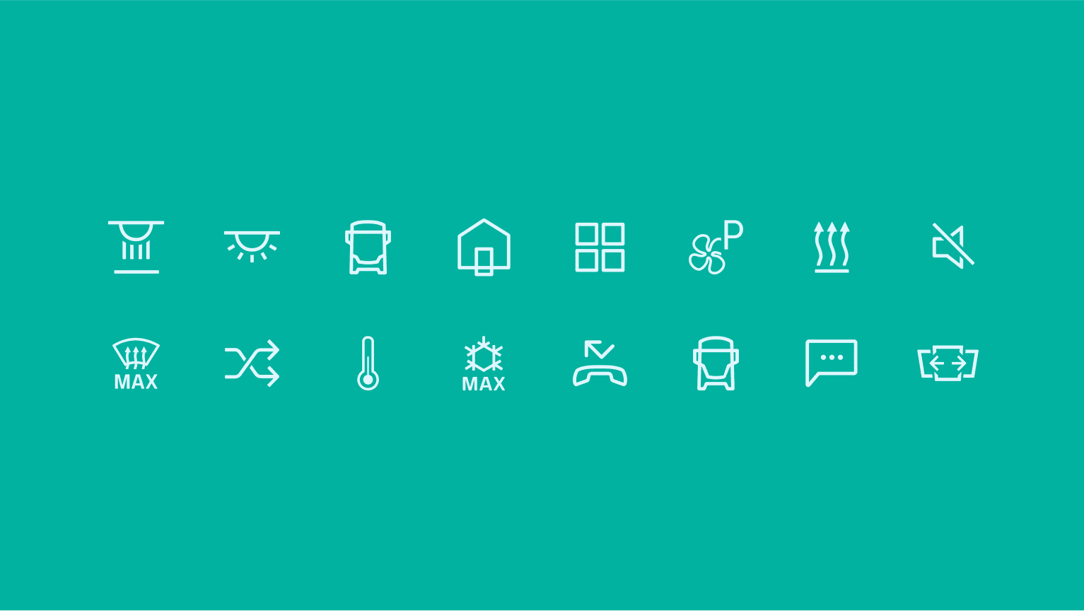
Iconography transcends words and language, enhancing communication. At Scania™, our icons are designed to streamline and simplify navigation and information within our digital experiences.
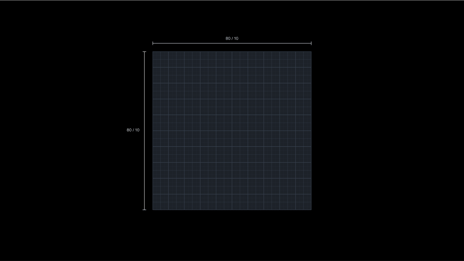
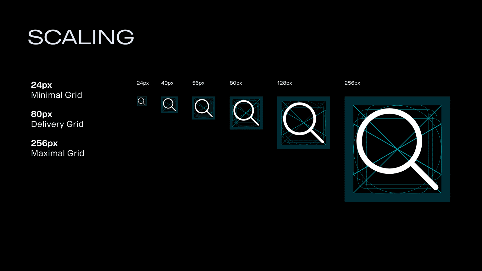
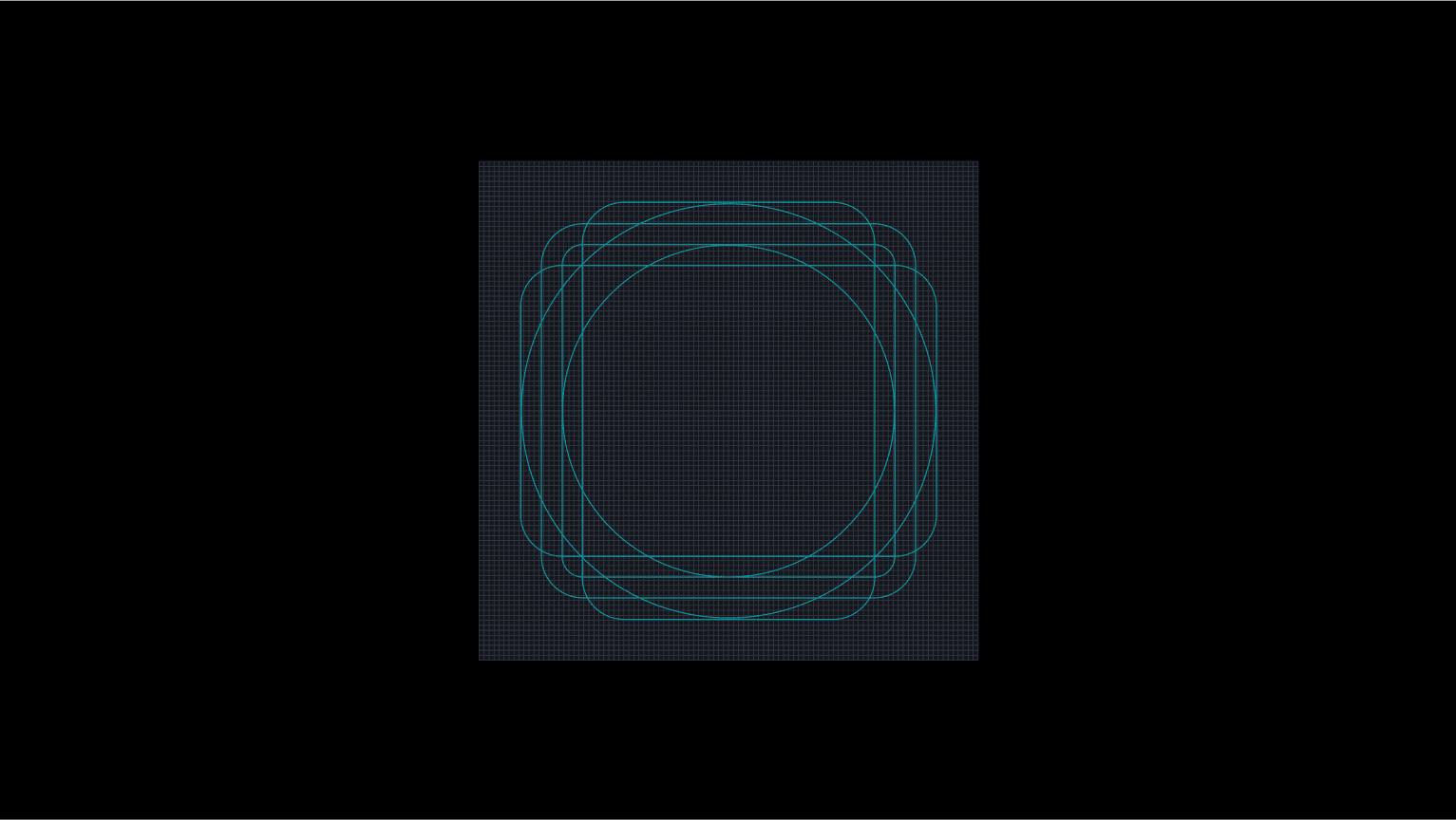
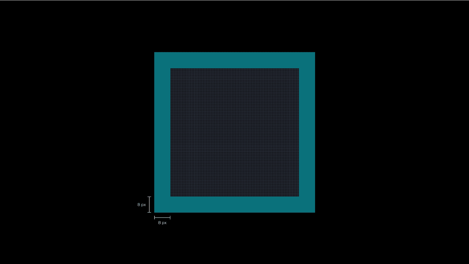
Each icon is meticulously crafted within an 80×80 pixel grid and 32×32 pixel grid respectively, ensuring uniformity across our designs. This grid includes a minimum of 8px padding on all sides and adheres to a standard line weight of 4px, with provisions for optical adjustments to maintain visual integrity.
For the foundation of our icon design, we use the same 80×80 pixel grid, which supports precision and scalability. Icons are then flattened for integration into our comprehensive icon library, optimised for clarity and functionality across various applications.
Sizes
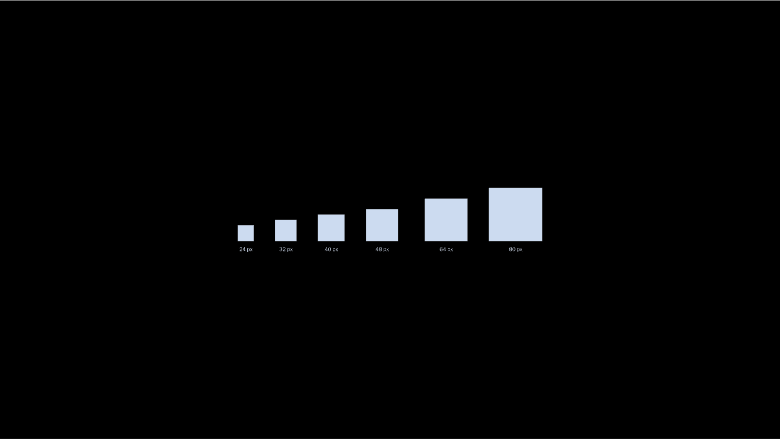
Our icons are designed in 80×80 px (DDW) or 32×32 px (SDDS) grid as a master grid size. DDW icons have a deviating line thickness and clearspace to align with other pictograms and telltales (SDDS icons scaled to 80×80 px would have 5 px line thickness and clearspace).

Level of detail
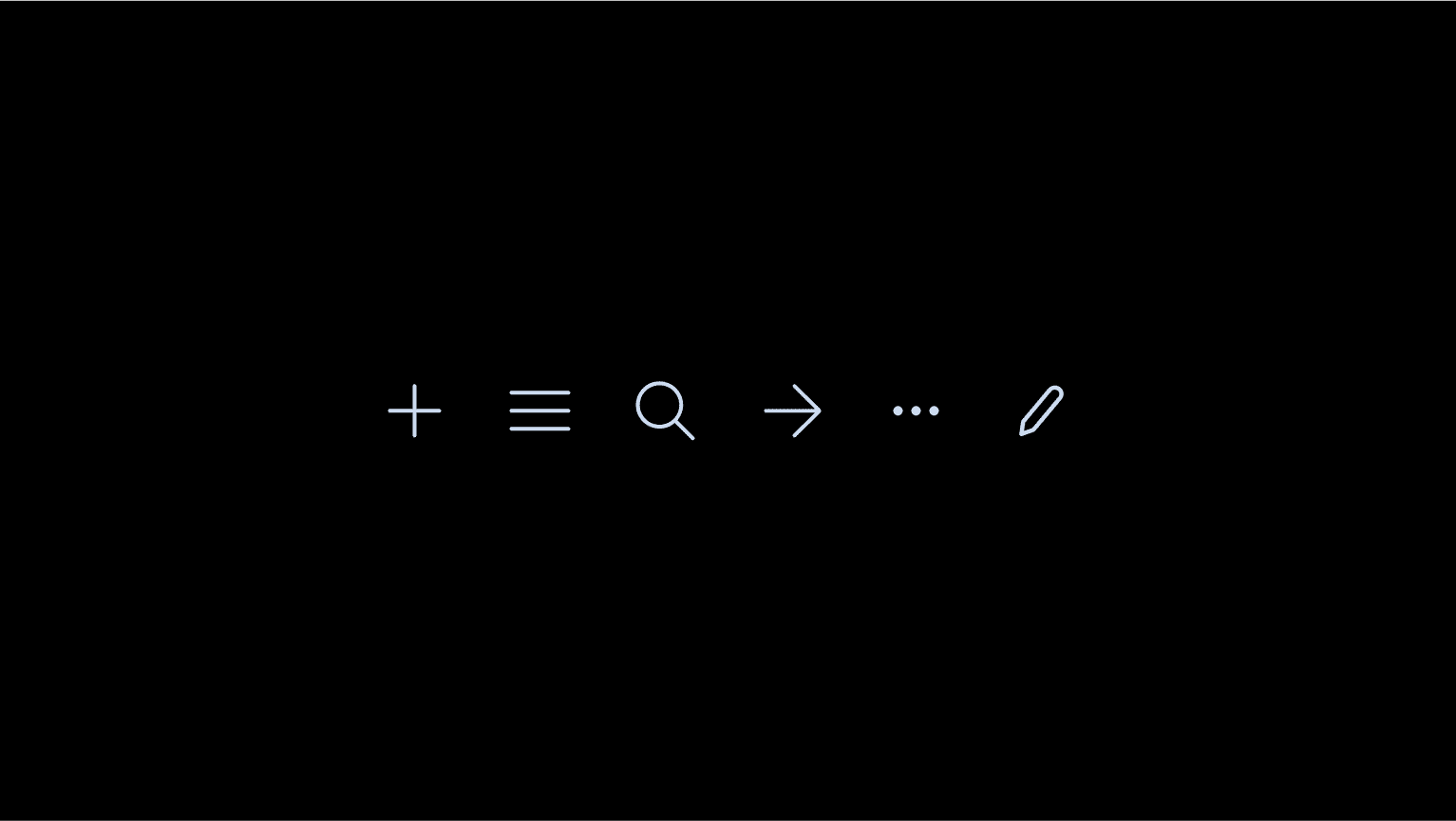
Our icons should visually be as simple and clear as possible to communicate the function it represents efficiently. Conform to established industry standards if possible when designing icons for our icon library.
01. Styling
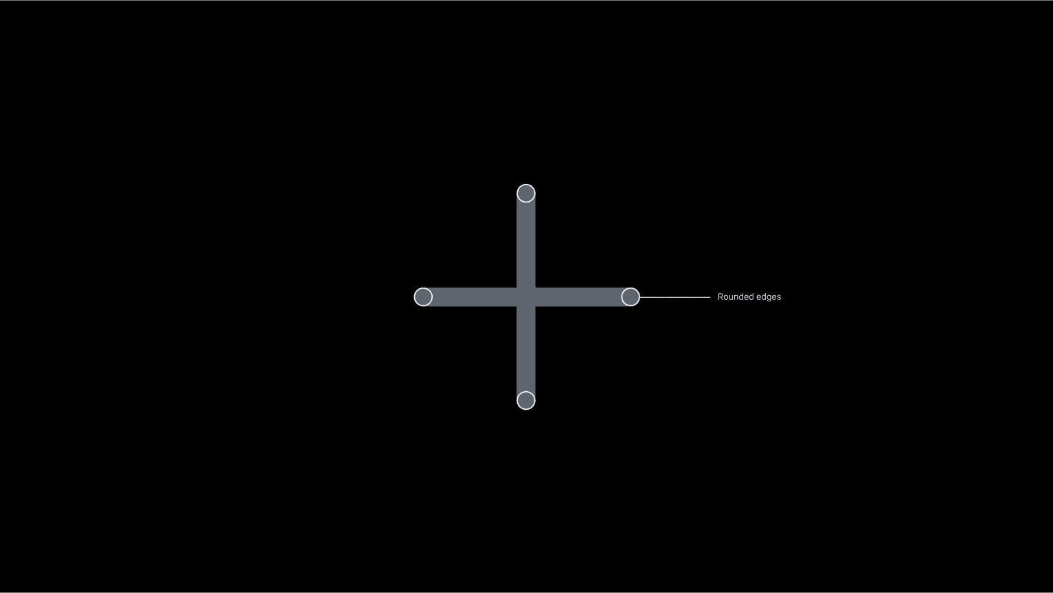
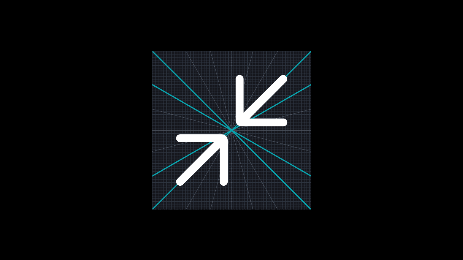
All Global icon paths should have rounded corners and adhere to the construction grid
02. Scaling
Our strategy uses minimalist pictograms to simplify and visualise complex information effectively, enhancing clarity and navigability. These universally recognised symbols, including menu icons and indicators for climate control, lighting, and vehicle functionalities (excluding warning indicators), are designed for seamless integration across both digital and physical environments.
03. Guidelines
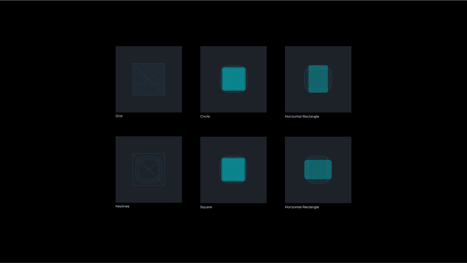
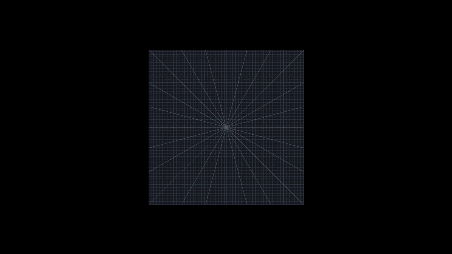
Icons are build based on a grid divided in 2px units. Four keyshapes deriving from the Scania™ logo structure can be used as guides to create a consistent UI Icon Kit.


04. Clearspace
Pictograms respect a clearspace of 8 px around on 80×80 px grid.
AFRY x Scania™
🇸🇪 — Finns det hjärterum, finns det stjärterum